Expressing the soul of an iconic institution.
Identity
YWCA
case study
#6f278a

The Young Women’s Christian Association, the YWCA is an organisation founded on Christian values, which has grown into a global community of girls, women and non-binary from every faith, culture and belief system, all working towards a common goal – positive change for girls and women.
<p style="font-weight: 400">Established in New Zealand in 1878, the YWCA celebrates a long, rich history of challenging the gender status quo, but with this history comes the challenge of remaining relevant to today’s girls and women.</p>
<p style="font-weight: 400">Concerned with underlying stereotypes, while working with an outdated, inconsistent brand identity, the YWCA Auckland tasked Spruik with the challenge of redefining their brand positioning and developing a new brand identity for implementation across the Auckland region. Despite its legacy, every brand touchpoint was up for discussion from the name to the logo.</p>
<p style="font-weight: 400">The research and strategic aspect of this project took time to resolve as we navigated our way with multiple stakeholders, some with different perspectives, all equally valid in their views.Eventually, it became clear that the YWCA name was still effective, still meant something and if strengthened, could still play a key role in growing the organisation.</p>
<p style="font-weight: 400">Through comprehensive research and extensive brand and culture workshops, it became abundantly clear that the YWCA has grown, adapted and changed throughout its history, and will continue to do so into the future. This adaptability creates a diverse cross-section of audiences and stakeholders with whom they speak to.</p>
<p style="font-weight: 400">By developing clear audience personas, we were quickly able to pinpoint commonalities, which then informed the development of their brand essence –</p>
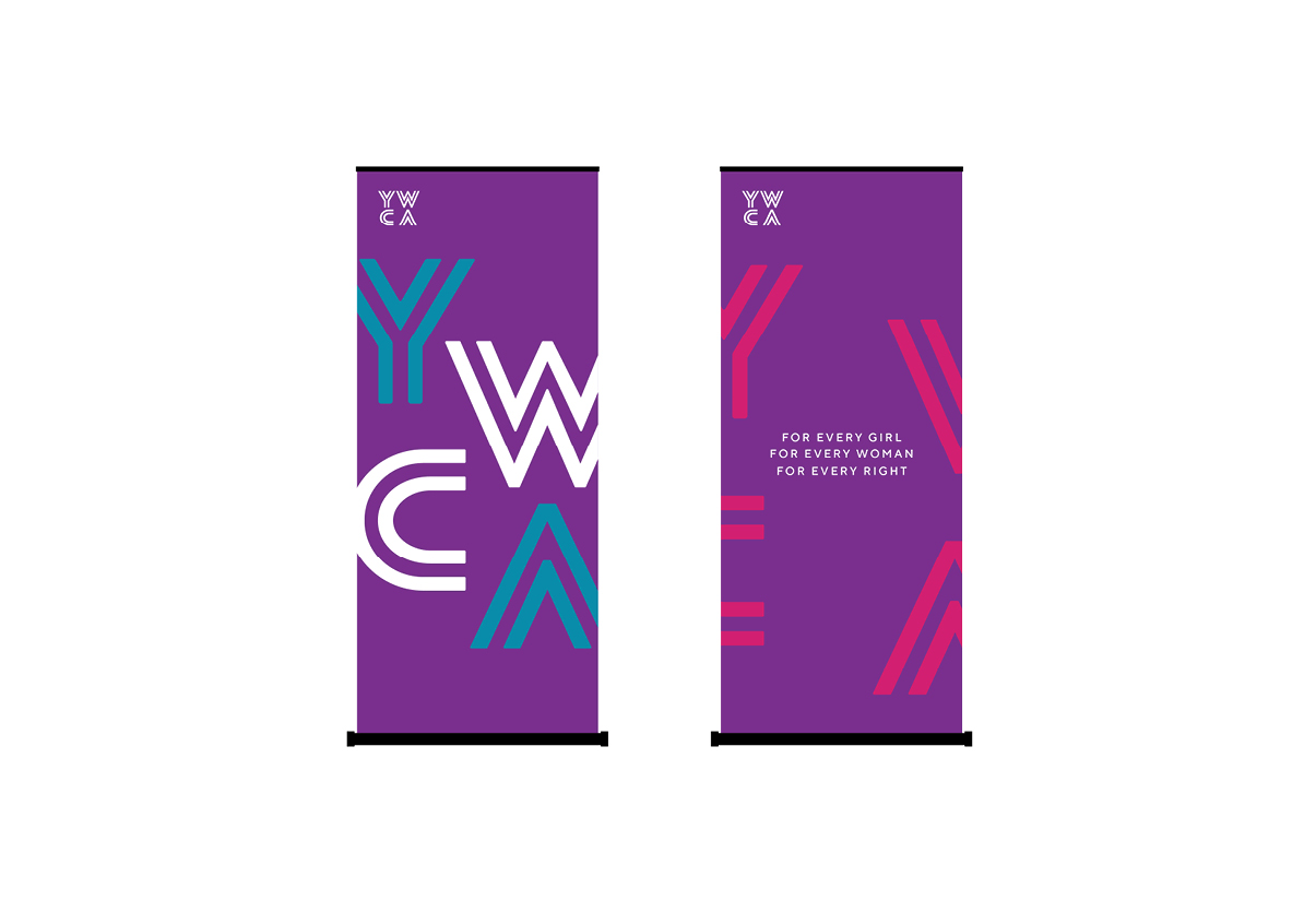
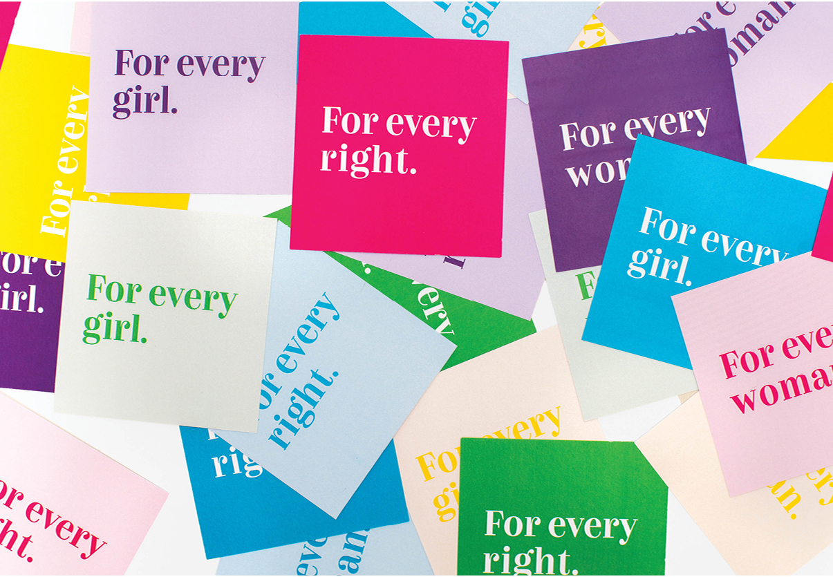
<p style="font-weight: 400">For every girl. For every woman. For every right.</p>
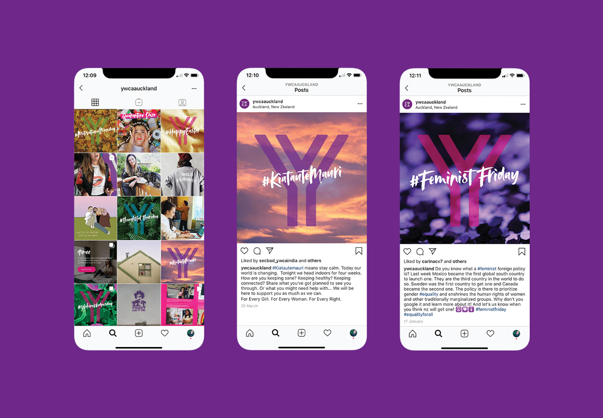
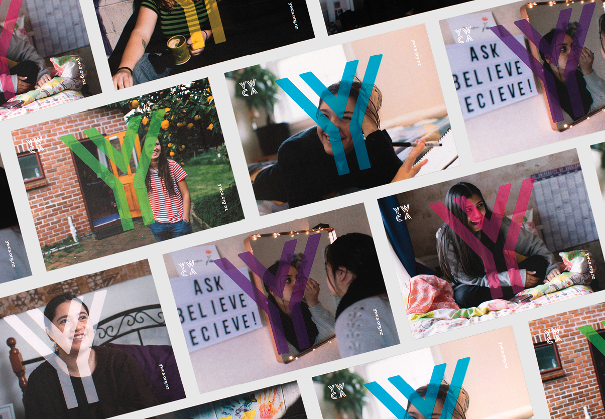
<p style="font-weight: 400">The brand essence not only respects the YWCA’s history but also formed the foundation for us to build an engaging visual identity, which was anchored around the core concept of equality.</p>
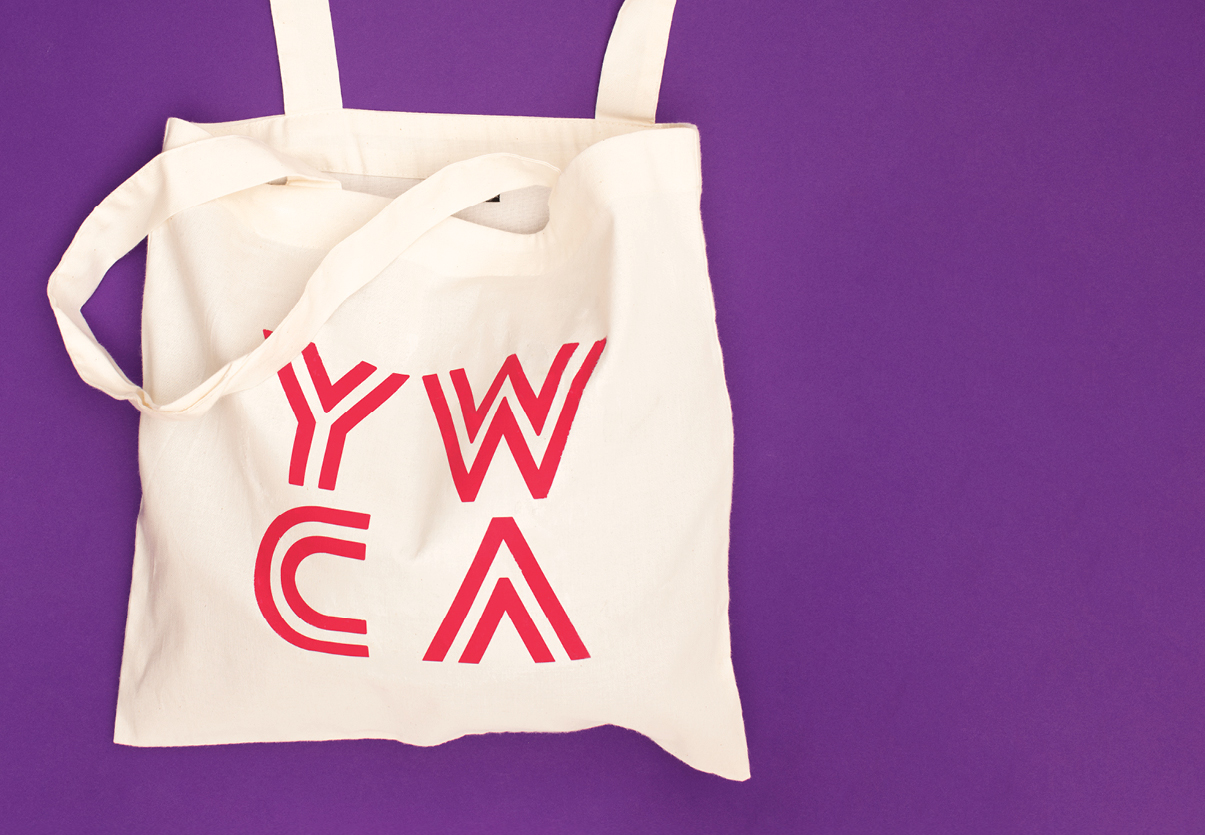
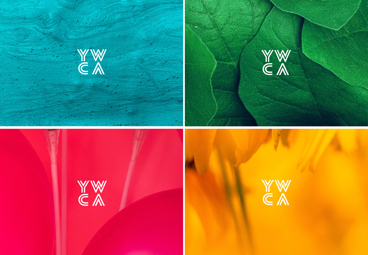
<p style="font-weight: 400">Through dual graphic elements; a colour palette representative of both women and girls; contrasting typography; and intersecting imagery and content, we have built an identity that is not only flexible but also represents the impact the YWCA makes on the girls and women of New Zealand.</p>
<p><span style="font-weight: 400"><a href="https://www.ywca.org.nz/"><strong>ywca.org.nz</strong></a></span></p>
Placeholder text
