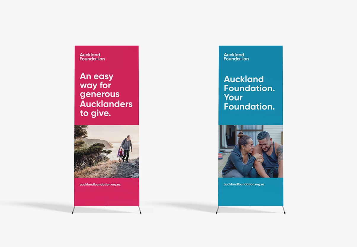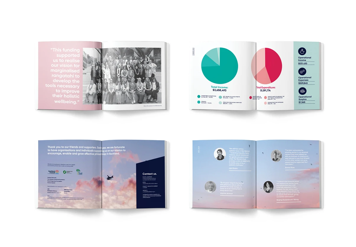

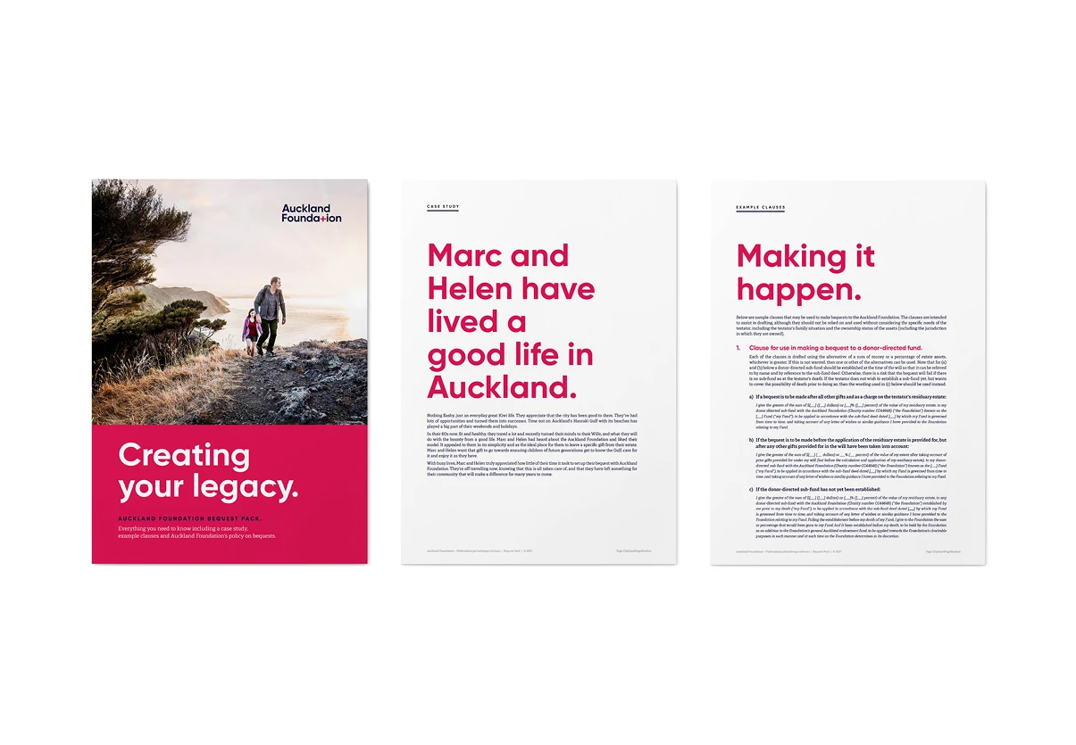
The brand needed to portray Auckland Foundation’s vision of ‘Generosity making a better Auckland’, while also reflecting their brand values. It needed to encompass the diversity of Auckland – regions, cultures and people – as well as the diversity of giving opportunities. The brand also needed to resonate with the professional advisors that Auckland Foundation works with – law firms, investment advisors, accountants, and the like.
The plus sign is a symbol of addition, positivity, growth and generosity, all sentiments which relate to Auckland Foundation’s values and their vision for Auckland. It is a symbol that clearly represents the brand’s core ethos as well as the services they provide. Coupled with four contrasting brand colours to represent the four potential giving opportunities to grow a better Auckland – Live Well, Enjoy, Nurture and Celebrate.
The core brand system utilises different logo and colour combinations that can be used to represent different funds, appeal to different target audiences and provide visual contrast across various brand activations. When paired with modern typography and the use of local, people-driven imagery we help to solidify the friendly and approachable nature of the Foundation.
“Spruik were integral to the successful rebranding of our organisation. Thanks to an incredibly supportive and creative team, we now have a unique brand that beautifully articulates who we are and what we represent, and a website that’s frequently complimented on as a standout by our peers.” Nicola Edwards, Communications and Grants Manager, Auckland Foundation
