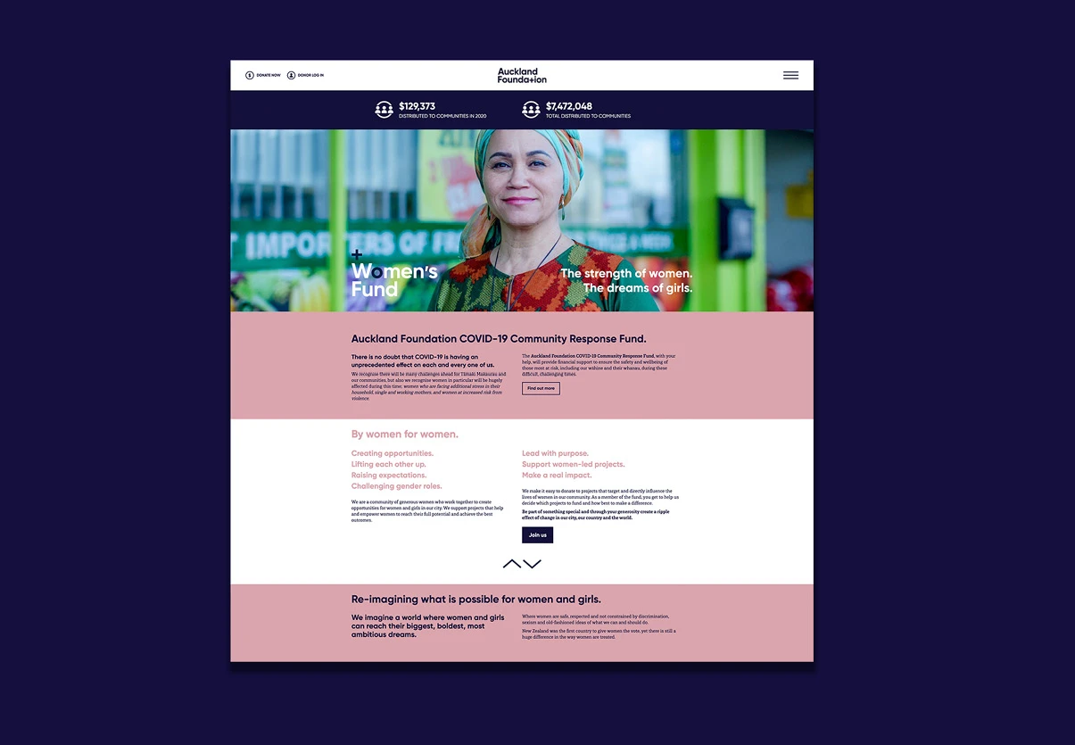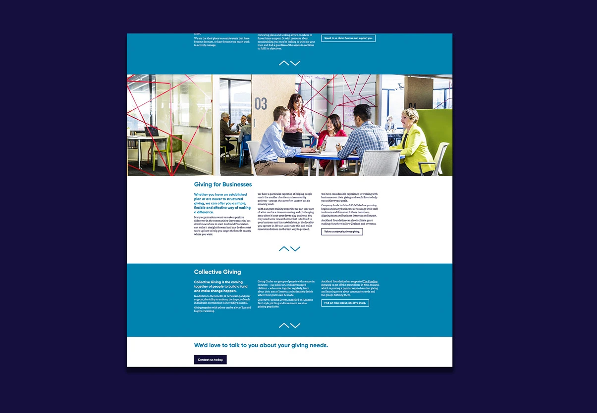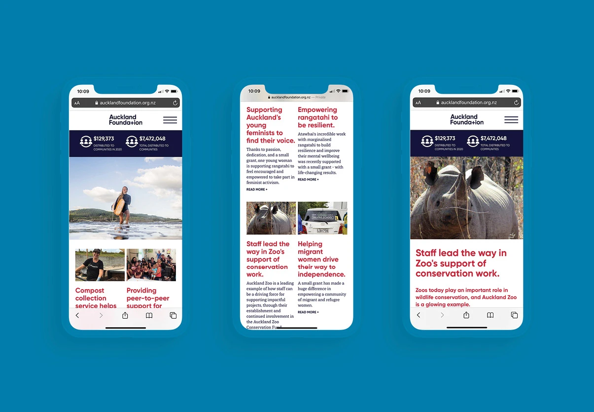


One of the primary issues with the existing site was focussed on feedback from users around confusion about the services Auckland Foundation provide. To address this we needed to understand the various user journeys to ensure we provided a platform that includes key information for people donating, people applying for grants, and people working in professional advisory roles.
The website needed to clearly explain what they do; the options available for people wanting to give; the process required for grant applicants; and to also celebrate the incredible work they achieve within the community.
Donors required an easy-to-use portal to make one-off donations or recurring donations to various funds, grant applicants required easy to use application forms, and professional advisors required informative resources for the benefit of their clients.
Through thorough testing of their existing site, we were able to identify common pain points, which then helped to build a more intuitive user experience. We identified pages that were redundant and worked closely with the Auckland Foundation team to structure a clear site map for different users, enabling quick access to relevant information.
Using a robust, highly customisable and easy to use CMS, the Auckland Foundation team can edit, add and adjust pages, as and when required. This has resulted in a site that outperforms their old site inefficiency, customisation, site speed and usability.


