A third of the population will suffer from dry-eye symptoms at some stage. As a result, there are many well established brands in market, competing for sales with new products and formulations.
The Blink product range has been available in pharmacies for some time and has suffered from little marketing investment. Its new brand manager wanted to reignite the brand, increasing both distribution and awareness.
Brand Identity
We had some tight design boundaries, set out by the existing packaging design and established core colour palette. With a use of retro typography, the identity was conveying a relatable, yet casual tone. It simply didn’t speak to the quality or the scientific formulations of the products. For the range to be seriously considered by self-selecting consumers, and optometrists alike, we needed to develop an identity that would better align to the brand values and standards.
To increase Blink’s overall appeal, we needed to give it a more sophisticated aesthetic.
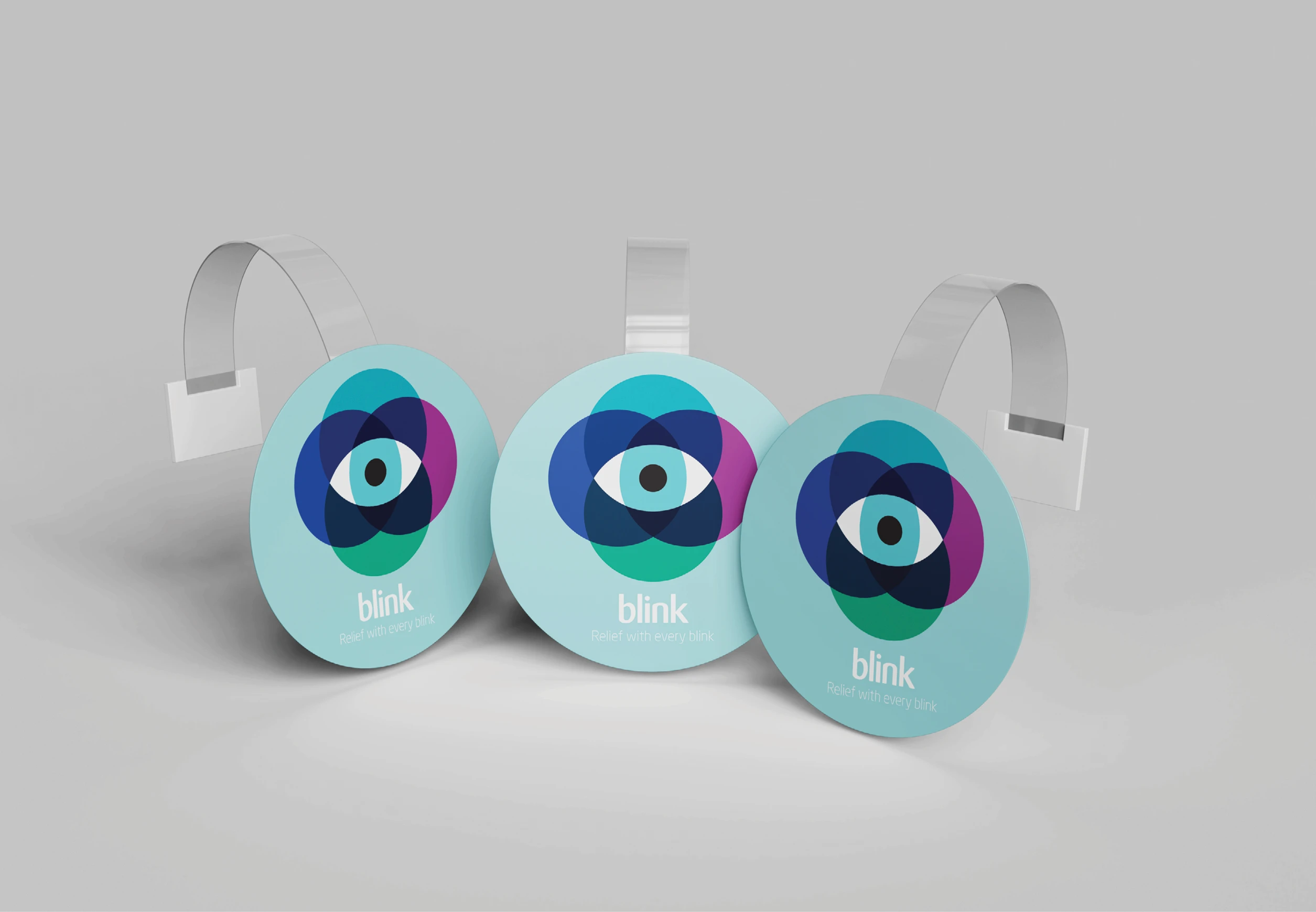
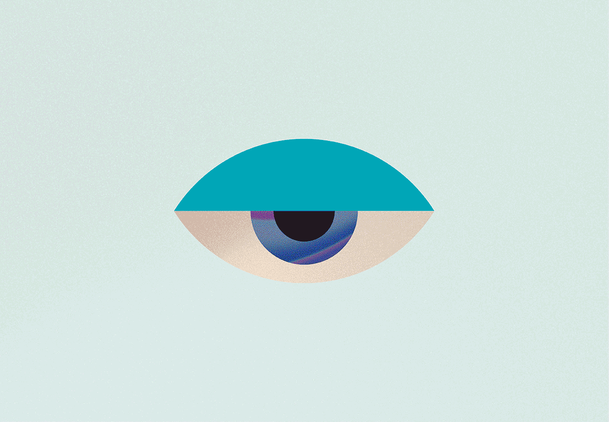
We developed a system of graphical elements that feature droplets and ripples of water. The clean, minimal design and use of muted brand colours, create a sense of stillness and calm. The desired state of an audience who are suffering from uncomfortable dry-eye symptoms.
Campaign creative
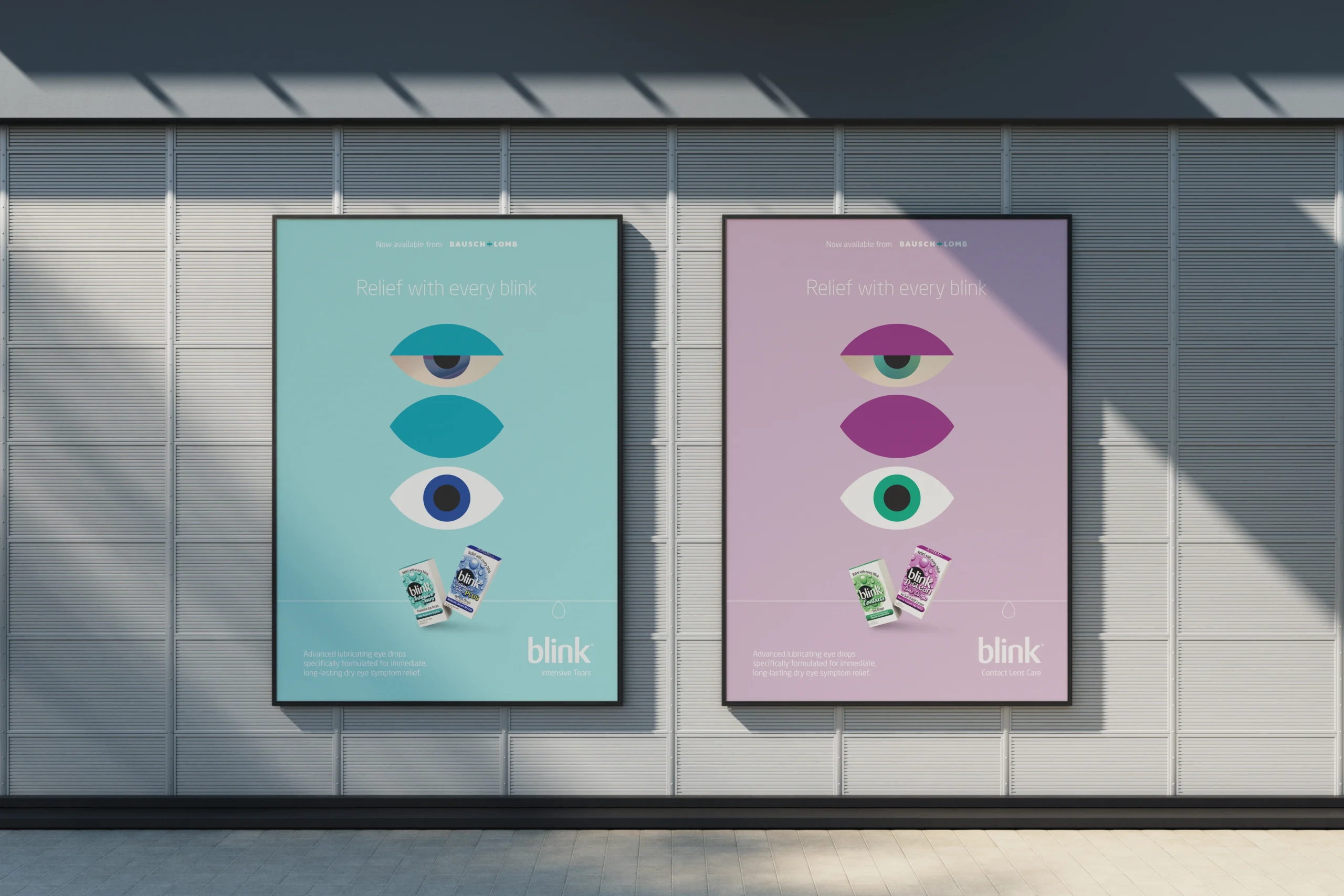
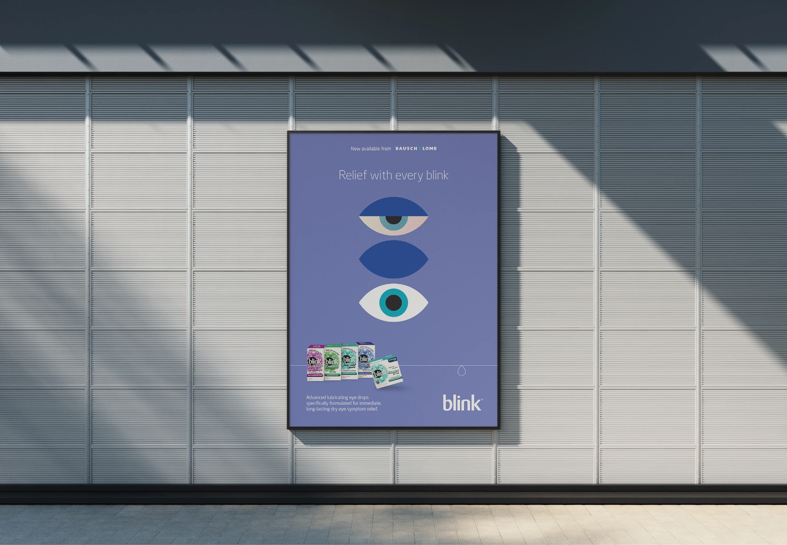
‘Relief with every Blink’
Blink had an established tagline that worked well – it spoke to both the brand benefits and range of products. However, it was seldom used.
Our campaign creative was developed to hero the tagline, utilising graphical elements to tell their story, simply.
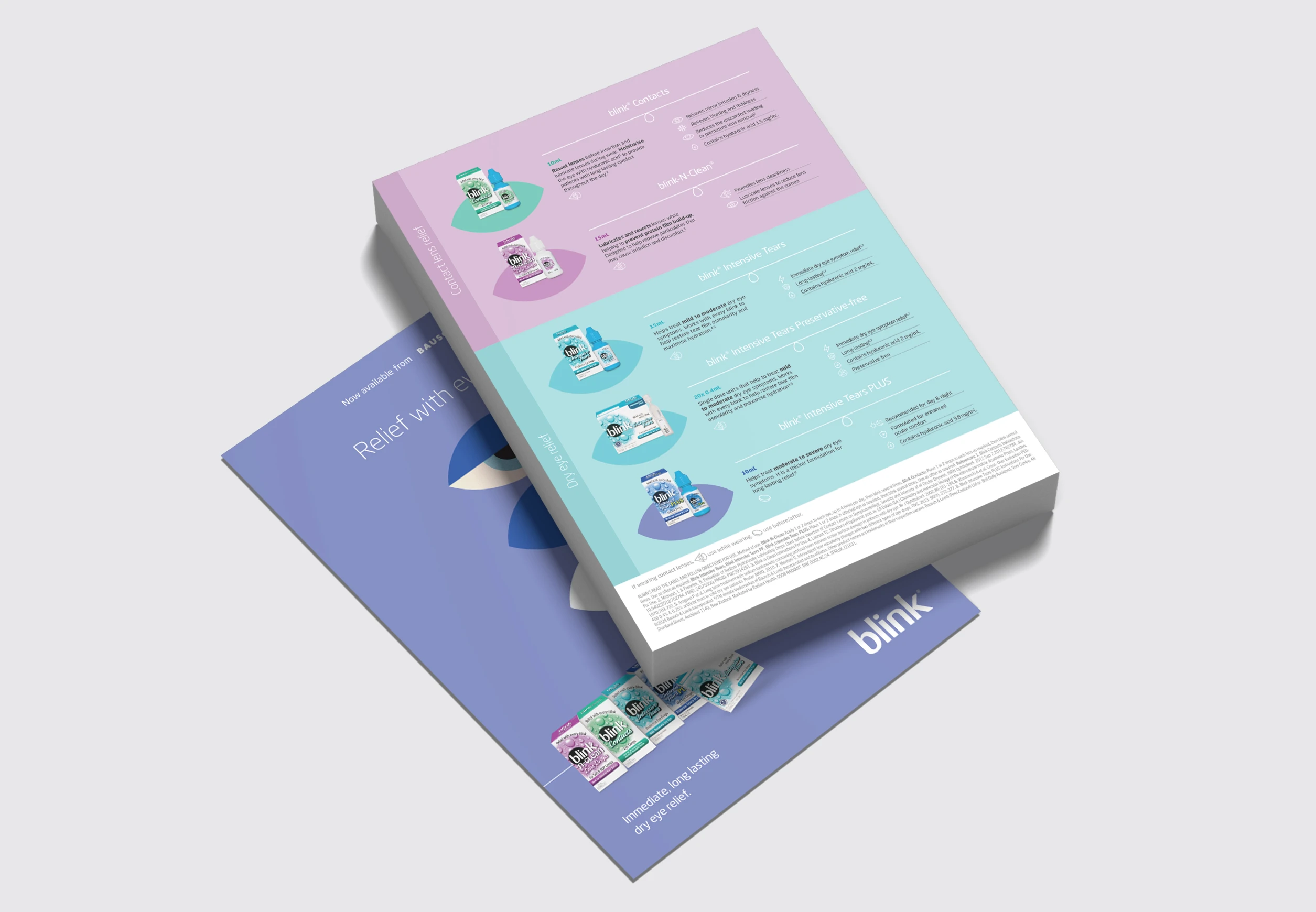
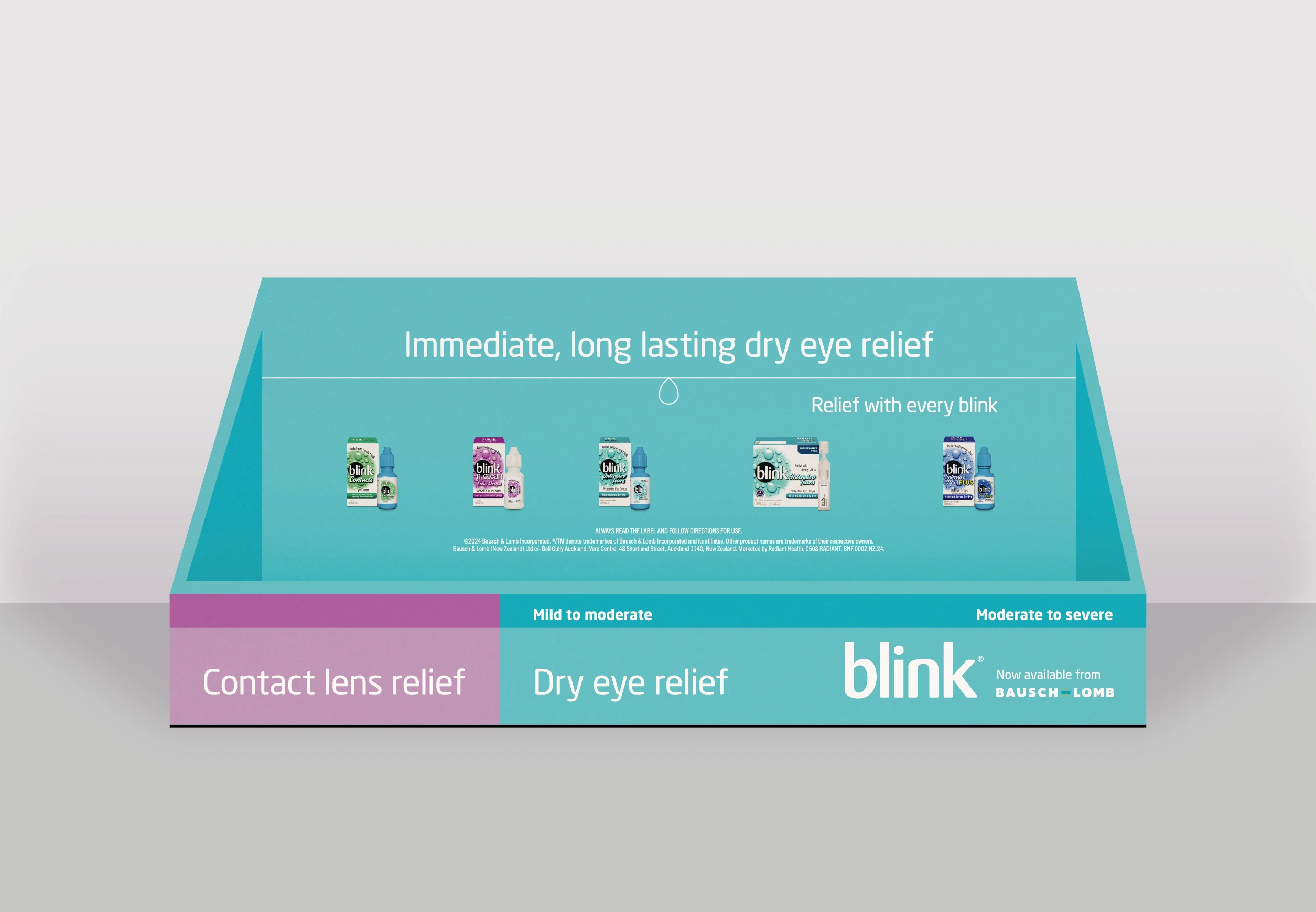
Product colourways formed a series of key visuals. Each highlight the negative symptom and immediate, positive resolve that the range of products offer.